Any facility.
Complete intelligence.


Learn what office space utilization software, sensors, and dashboards actually need to measure to drive real decisions for your facility.

Office space utilization measures how much of your available workspace is actually being used, across desks, meeting rooms, collaboration zones, and common areas, at any given point in time. It is the ratio between space in active use and total space available, and it has become one of the few metrics that connects real estate cost directly to operational decisions.
The global average hit 56% in 2026, up from 54% the previous year and 49% in 2024, according to JLL's occupancy benchmark report. That steady climb matters: it signals that hybrid work is no longer a temporary disruption but a settled pattern. Hybrid occupancy is stabilising within the 50 to 60 percent range, which means most enterprise portfolios are carrying roughly half their floor plates idle on any given day.
That gap is not waste sitting around waiting to be noticed. It is a decision point teams often miss. Teams managing global capability centers in India and multi-site portfolios elsewhere are already asking the same question: how do we right-size without undercutting the experience that brings people back? The answer starts with measuring accurately.
Utilization rate and occupancy rate are often used interchangeably. They shouldn't be. The difference between them changes what you can act on.
Occupancy rate tells you whether a space is booked or assigned. Utilization rate tells you whether it was actually used. A meeting room booked for two hours that ran for forty-five minutes registers as fully occupied in a booking system and deeply underutilized in a sensor log. Both numbers are correct. Only one is useful for office space utilization analysis.
| Utilization Rate | Occupancy Rate | |
|---|---|---|
| Definition | Proportion of time a space is actively in use | Proportion of spaces booked, assigned, or occupied relative to total available |
| What it measures | Actual physical use (people present, sensors active) | Allocation or booking density |
| Typical data source | IoT sensors, badge readers, desk-booking systems with check-in | HR headcount, booking systems, lease data |
| How it informs decisions | Space right-sizing, layout redesign, energy scheduling | Portfolio planning, headcount-to-seat ratios, lease negotiations |
Peak occupancy (the busiest hour on the busiest day) sets the ceiling your infrastructure must support. Average occupancy tells you how much of the time you are actually near that ceiling. Running workplace utilization benchmarks against both figures prevents two common errors: over-building for a peak that arrives once a week, or under-building because the average looks comfortable.
The reason employees come to the office has shifted, and the shift has direct consequences for how floor space is allocated. According to CBRE's 2026 Global Workplace and Occupancy Insights report, 68% of respondents cite collaborating with colleagues as the primary reason they make the commute. Not focus work. Not habit. Collaboration.
That one number rewrites the space-planning brief. A portfolio optimized for individual heads-down work, rows of assigned desks with a handful of glass-walled conference rooms, does not serve a workforce that shows up specifically to be around other people. The mismatch shows up in utilization data before it shows up in an employee survey: collaboration zones at capacity on Tuesday and Wednesday while individual workstations sit empty.
The practical implication for facility and workplace leaders is that utilization tracking is no longer just a cost story. It is a design story. Understanding which space types are under strain and which are underused gives teams the evidence they need to rebalance, add more informal meeting areas, reduce fixed-desk density, and reallocate square footage without expanding the lease. An office space utilization study that captures space-type performance separately, not just aggregate floor-plate numbers, is where that analysis begins.
Space utilization tracking for hybrid offices works by pairing a data-collection method with the floor plan complexity and decision cadence that actually suits the building. There is no single correct method. There is a spectrum, and where an organization starts depends on what accuracy they need and what they are willing to spend.
Manual headcounts and badge-swipe reports are low-cost entry points. They answer broad questions about arrival patterns, but they miss what happens inside a floor once people are through the door. Desk booking software adds a layer of intentionality data, recording who planned to sit where, but bookings without a check-in step routinely overstate actual use.
IoT and radar sensors close that gap. Installed at the desk, room, or zone level, they generate continuous presence data without requiring any employee action. That continuous signal feeds an office space utilization dashboard with the granularity to distinguish a room that was booked and used, a room that was booked and abandoned, and a room that was never touched.
| Method | Accuracy | Cost | Real-Time Capability |
|---|---|---|---|
| Manual counts / walkthroughs | Low | Very low | No |
| Badge swipes / access control | Low to medium | Low (data already exists) | Partial (entry only) |
| Desk booking with check-in | Medium | Low to medium | Near real-time |
| IoT / radar sensors | High | Medium to high | Yes |
Connecting sensor data to a building management system unlocks a second dividend: energy scheduling that tracks actual occupancy rather than assumed occupancy. HVAC and lighting systems can respond to real presence rather than booking calendars, which reduces utility cost for office space without any manual intervention. Office space utilization via sensors, then, earns back part of its installation cost through energy savings rather than just through space decisions.
The right starting point for most enterprise teams is desk booking with sensor validation on high-traffic floors, then expanding sensor coverage to meeting rooms and collaboration zones as the data case builds.
Space utilization is calculated by dividing the time a space is in active use by the total time it is available, then expressing that as a percentage. A desk used for four hours of an eight-hour day is running at 50%. A meeting room booked for two slots in a ten-slot day is running at 20%; even if both sessions went to twelve people and the room holds eight. Scale that calculation across every desk, room, and zone on a floor, and you have a floor-level utilization rate you can defend in a real estate review.
The JLL 2026 benchmark sits at 56% globally, and that figure is worth treating as a floor, not a target. Headquarters buildings in gateway cities trend higher, often reaching 65 to 70% on peak days, because they concentrate leadership, collaboration, and the functions that require face time. Regional offices and GCC campuses tend to run closer to the global average or below it, reflecting lighter attendance patterns and a higher proportion of heads-down work that employees increasingly do at home.
A defensible internal target for most enterprise portfolios sits between 60 and 75%. Below 60%, the portfolio is almost certainly carrying more square footage than the workforce actually needs on any typical day. Above 80%, friction appears: employees struggle to find seats, meeting rooms are booked days out, and the experience deteriorates fast enough to show up in survey data. The productive range leaves enough slack for peaks without subsidising emptiness the other five days.
Office space utilization benchmarks are most useful when broken out by space type rather than averaged across a whole floor. A 65% aggregate can hide a collaboration zone running at 90% and a bank of focus booths sitting at 30%.
Improving utilization is a sequencing problem as much as a design problem. The interventions that cost the least come first; the ones that require capital follow once the data confirms where to spend it.
1. Eliminate ghost bookings. Add a check-in step, physical or app-based, to every desk and meeting room booking. Rooms not confirmed within ten minutes of the start time release automatically. Most organizations cut no-show waste by 20 to 30% before touching anything physical.
2. Convert assigned desks to hoteling. Hoteling improves office space by removing the one-to-one claim between employee and desk. A 1.2:1 seat-to-person ratio (rather than 1:1) on a floor that averages 60% attendance means nearly the same number of people fit comfortably while the desk count drops.
3. Zone by activity, not by team. Neighbourhood zoning places collaboration-heavy teams near informal meeting areas and quiet-work employees near focus pods, rather than mixing both needs on an undifferentiated floor plate. Given that 68% of employees cite collaboration as the primary draw to the office (CBRE 2026), that rebalancing changes which zones absorb demand.
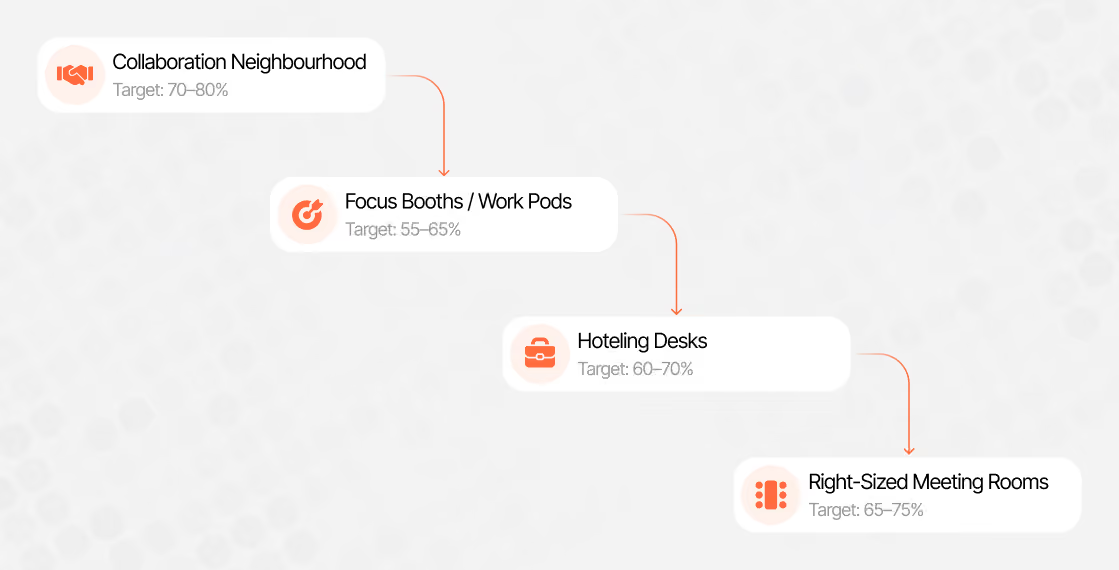
A zoned floor plan aligns space supply with attendance patterns, keeping each zone within its productive utilization band.
4. Right-size meeting rooms. Replace large boardrooms that data shows running at 30% capacity with two or three smaller rooms. Six-person rooms booked for two people are the most common single source of meeting-room waste in utilization studies.
5. Link HVAC scheduling to real occupancy. Schedule-based HVAC control that responds to live sensor data rather than fixed timetables reduces conditioning of empty spaces, a gain explored in detail through the ACREX India 2026 HVAC insights. The energy saving partially offsets sensor installation costs.
6. Build a utilization dashboard with weekly cadence. A standing office space utilization report reviewed weekly by the workplace team turns data into a feedback loop. Without a review cadence, even the best sensor data goes dark.
Workplace management software earns its place when it shortens the distance between raw sensor data and a decision a real estate team can act on. The dashboard is the test: if it cannot show you utilization by space type, by floor, and by hour of day in a single view, it is reporting, not analysis.
Sensor type shapes data quality before software enters the picture. PIR sensors detect motion and are inexpensive but miss stillness, a person reading quietly registers as absent. Radar sensors resolve that problem by detecting breathing and minor movement, which makes them the more reliable choice for focus-work zones. Camera-based systems can count people accurately but introduce privacy review requirements that slow procurement in many organizations.
Four questions worth putting to any vendor:
A focused RFP built on those four points is shorter than most, and more likely to surface the differences that matter.
Start with a baseline. Before any redesign or lease decision, run a four-to-six-week office utilization study across every space type: desks, meeting rooms, collaboration zones, and common areas. That baseline is the only honest answer to what is actually happening, as distinct from what the booking calendar suggests.
Benchmark against it. The JLL 2026 global average of 56% gives you an external reference; your internal benchmark by space type gives you the real problem statement. A floor averaging 58% overall may still be hiding a collaboration zone at 91% and a row of focus booths at 28%. The aggregate obscures the action.
Then act in sequence. Ghost bookings first, because eliminating them costs almost nothing and improves the data immediately. Zoning and desk-ratio changes next, once the corrected data confirms where demand actually concentrates. Capital decisions, like room reconfiguration or digital twin software that models the floor before any wall moves, come last, backed by weeks of clean evidence rather than a hunch.
A facility intelligence platform like Apptimus sits across all three stages: collecting the sensor data that builds the baseline, surfacing the benchmarks and alerts that reveal the gap, and integrating with building systems so energy scheduling responds to real occupancy rather than planned occupancy. That integration is where the cost story closes, because a space decision and an energy decision made together using the same dataset are almost always better than the same decisions made in separate reviews six months apart.
The baseline takes a month. The first decisions follow quickly. What compounds over time is the habit of measuring.
A good office space utilization rate for most enterprise portfolios sits between 60 and 75%. Below 60%, the portfolio is likely carrying more space than the workforce needs on a typical day. Above 80%, employees begin to struggle for seats and rooms, and the experience deteriorates. The JLL 2026 global benchmark of 56% is a useful external reference, but the more actionable number is your own utilization broken out by space type, because averages hide the zones that are genuinely overloaded.
Utilization measures whether a space was actively in use. Occupancy measures whether it was booked or assigned. A meeting room booked for two hours that ran forty-five minutes is 100% occupied in the booking system and roughly 38% utilized in a sensor log. Both are accurate; only one tells you where space is being wasted.
Continuous sensor data is the most useful, because it captures variation by hour and day rather than producing a single snapshot. A weekly review cadence for the utilization report gives workplace teams enough frequency to catch emerging patterns without drowning in daily noise.
It can, and the question deserves a direct answer in any vendor evaluation. Radar and PIR sensors detect presence without identifying individuals, which resolves most privacy objections. Camera-based systems require more careful policy and anonymization design. Communicating clearly to employees what is measured, how it is anonymized, and what it is used for addresses the concern before it becomes one.
Privacy is important to us, so you have the option of disabling certain types of storage that may not be necessary for the basic functioning of the website. Blocking categories may impact your experience on the website. More information